↑ Read the latest from the desks · fresh intelligence, published daily✦Quiet reading✦No ads, ever✦Ad-free articles read by humans today …↑✦Boards engagement today … people · … AI✦Corporate brand & media services✦Made in Virginia Beach since 1997✦
The BriefingPlatinum signalNovember 13, 20262 min readAd-free
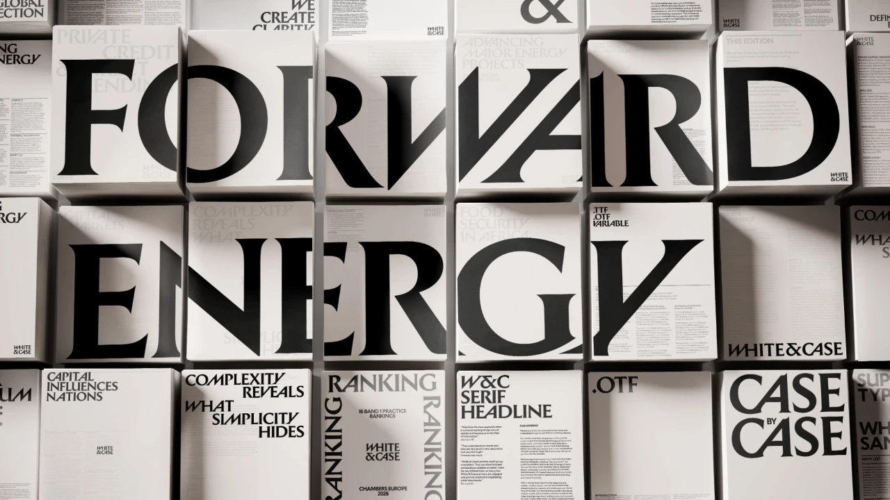
White & Case Ditches Law Firm Serif for Kinetic Identity
Global firm completes rebrand with Roman-inspired logo and repositioned materials, signaling shift from traditional legal aesthetics to market-facing presence.
The Briefing deskThe Briefing · Huang GoodmanSource: CreativeBoom ↗
Source image
White & Case has completed a major rebrand developed by Uncommon Creative Studio, replacing its traditional law firm identity with kinetic serifs and a Roman-inspired logo. The new mark and positioning require premium materials—from business cards to environmental signage to client collateral—that reinforce a different market stance. This move matters because law firms rarely rebrand at this scale, and when they do, the materials execution determines whether courts, in-house counsel, and institutional buyers read the identity as deliberate or defensive.
What the rebrand signals
The shift from traditional serif to kinetic serif tells institutional buyers that White & Case is repositioning away from staid heritage messaging toward visual language that reads as studied and forward-facing. Roman inspiration anchors the work in classical authority—not novelty. This is not a chase after tech clients or venture capital. Instead, it signals a firm addressing in-house legal departments and C-suite offices that keep counsel relationships for decades and expect their advisors to read as serious, stable, and visually literate. The rebrand lives or dies in the details: letterheads, case folders, signage in offices across London, New York, and Shanghai, and every printed item that passes across a client's desk.
How it stands against its field
Large law firms compete on perceived stability and institutional weight. Baker McKenzie, Clifford Chance, and Latham & Watkins all operate under identities built across decades—minimal change, maximum recognition. White & Case's rebrand is a deliberate break from that playbook. The firm is betting that law buyers—especially Fortune 500 general counsel and family office legal teams—now expect their external counsel to signal visual sophistication alongside legal chops. No SEC filings yet disclose the cost of this rebrand or its effect on client acquisition, retention, or rates. Watch the firm's next quarterly disclosures for changes in client concentration, rate realization, and M&A activity. If the rebrand works, competitors will follow. If it underperforms, it signals that institutional legal buyers still read heritage and stability as more trustworthy than visual reposition.
What to watch in next filings
White & Case is a partnership, so public disclosures are limited compared to publicly traded legal services firms. Look instead for signals: press coverage of new client wins, partner departures or arrivals, practice group expansions, and real estate moves. If the rebrand holds—if clients respond by consolidating work, rates hold or increase, and talent attraction improves—the materials investment will have paid. If the firm loses accounts within eighteen months or partners cite positioning confusion as a reason to leave, the rebrand will read as costly misstep. The real test is not design awards but client file growth and rate sheets filed in matter management systems nobody sees.
Watch whether competing firms move on their own identities within the next two years.
TikTok / Reels hook
"Global law firm drops traditional serif. Is visual reposition enough to move the needle against Baker McKenzie and Clifford Chance."
Questions buyers ask
Why would a law firm rebrand when heritage matters most
Law firms rebrand when they perceive a gap between how clients see them and how they need to be seen. White & Case is signaling to institutional buyers that it reads the market differently than its competitors. Visual sophistication is now table stakes for firms competing for Fortune 500 general counsel and multi-generational family office work.
What materials does a law firm rebrand actually require
Business cards, letterheads, case folders, office signage, website assets, matter management system templates, pitch decks, and environmental graphics across multiple offices globally. Each piece must reinforce the new positioning without reading as marketing collateral—law buyers distrust visible selling.
How do we measure if this rebrand actually worked
Track client retention rates, average matter value per client, new client wins in target segments, partner satisfaction scores, and whether rates hold or increase year-over-year. Public announcements of major client wins or losses offer first signals. Law firm performance lags visual reposition by six to eighteen months.
Branded by POPS4 · proof in 60 seconds
For the principal
Monitor whether major law firm rebrands drive client consolidation and rate power—early signal of market-wide positioning shifts among your external counsel.
For the operator
Law firm rebrand materials require cultural fluency with institutional buyers; design alone does not move needle without flawless execution across every touchpoint globally.
For the house
Track White & Case rebrand impact on client metrics and competitor response. File signals into law firm market repositioning thesis. Measure whether visual reposition displaces competitors within institutional legal buyer consideration sets.
Written with artificial intelligence from public sources and published without individual human review. Corrections: jenny@pops4.com.
蔵
Huang Goodman · brand success, measured and built
One house behind your brand.
The branded-identity layer Chiefs of Staff and heritage CMOs route through — your name imprinted on real authorized stock, your pick of 200+ brands and 70,000 products, shipped from one accountable house. Nine editorial desks publish the intelligence those operators read before they sign.
200+authorized brands
70,000products · virtual proof on each
9 deskspublishing daily
1997one house, since
70,000 SKUs · virtual proof in 60 seconds · no platform fee · blind-shipped · ASI #217876
Your next customer won't visit your website. Their AI will.
AI assistants have quietly taken over the first step of buying — they answer from catalogs they can read and shortlist whoever can actually ship. Two questions now decide whether you exist to that buyer: can a machine read your catalog, and can you fulfill the order. Most brands fail one or both and never find out why the orders went elsewhere. The winners of this shift aren't the loudest. They're the most readable. Build for the machine that's about to do the shopping.
Built by the craft floor — apparel, media, packaging, and secure print.
This trade runs on hands, not desks. Imprint manufacturing & Komori heritage press through approved vendors · Canon high-speed secure-media operations is a craft floor — genuine Six Sigma discipline applied to ink, thread, foil, and registration, where a hundredth of an inch is the difference between a brand that reads serious and one that reads cheap. POPS4 is built by exactly those operators: independent, boots-on-the-ground engineers who carry their own book, read a client in microseconds, and put their name on every run. Beyond our own Virginia Beach floor, we work with a vetted network of craft manufacturers across the US — each meeting the highest excellence in QC standards in the industry, each a specialist in its own discipline — so apparel, hard-goods imprinting, media manufacturing, packaging, and secure printing all go to the bench built for them, coordinated from one accountable hub. Short-run from twenty-five units, volume to five hundred thousand. Two hundred authorized national brands, seventy thousand SKUs with virtual proofing on every one. Art archived for instant reorders. Net-thirty corporate terms, NDA-standard white-label — your name on the work, or none at all.
Strategy, positioning, identity, creative, and messaging — wired into an AI system that publishes and distributes on its own. Nine editorial desks generate the authority, the production house ships the physical proof, and the attribution layer tells you which post sold which SKU. What you get is an operating layer — content, catalog, and order path under one roof — that keeps working whether or not you are in the room. Built for principals who would rather own the machine than rent the agency.
Named-account programs — one desk, quiet delivery, NDA-standard.
One point of contact who already knows the file, so nothing restarts from zero between engagements. The work ships blind, under NDA, with your name on it or none at all. Built for single-family offices, heritage-house CMOs, sports-ownership groups, and the agencies that white-label our production. The relationship is the product; the merch is the proof of it.
SFO · Chief of Staff desk. Principal household, properties, aircraft, yacht, calendar, philanthropy — one file.
Shop seventy thousand products. Virtual proof on every one. 24/7.
Drop your logo on any product and see the virtual proof before asking. Quote routes direct to the desk. MCP catalog for AI agents. Celeste for the fast conversation. Full self-service checkout in development.